Runkeeper heatmaps, part 2
Today I received a newsletter from Mapbox that linked to a tutorial for JavaScript based heatmaps. It looks pretty cool, and I wondered how it might look used to plot runs.
I wrote in November about Runkeeper heatmaps and a method to generate images from run data on a computer. It requires special programs and isn’t super easy for a newcomer. When I was first researching this, I had a small interaction in the comments on the source article with James Chevalier, who started a web service called CityStrides. I didn’t check out the service at that time, as Chevalier said he didn’t have heatmaps, yet at least.
In reviewing the Mapbox example, I saw the JavaScript was using about 5,000 data points in the map. I did a cursory calculation of my runs and found I’d need to graph a few hundred thousand points to make a heatmap of all my runs. So I duplicated the points in the sample file to get to 500K, and saw it still seemed to load fine. In theory I might be able to graph all my runs following that Mapbox example, assuming I wrote some script to convert the Runkeeper exports to the GeoJSON format.
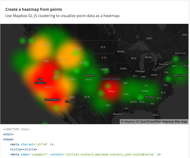
mapbox_heatmap_example.png
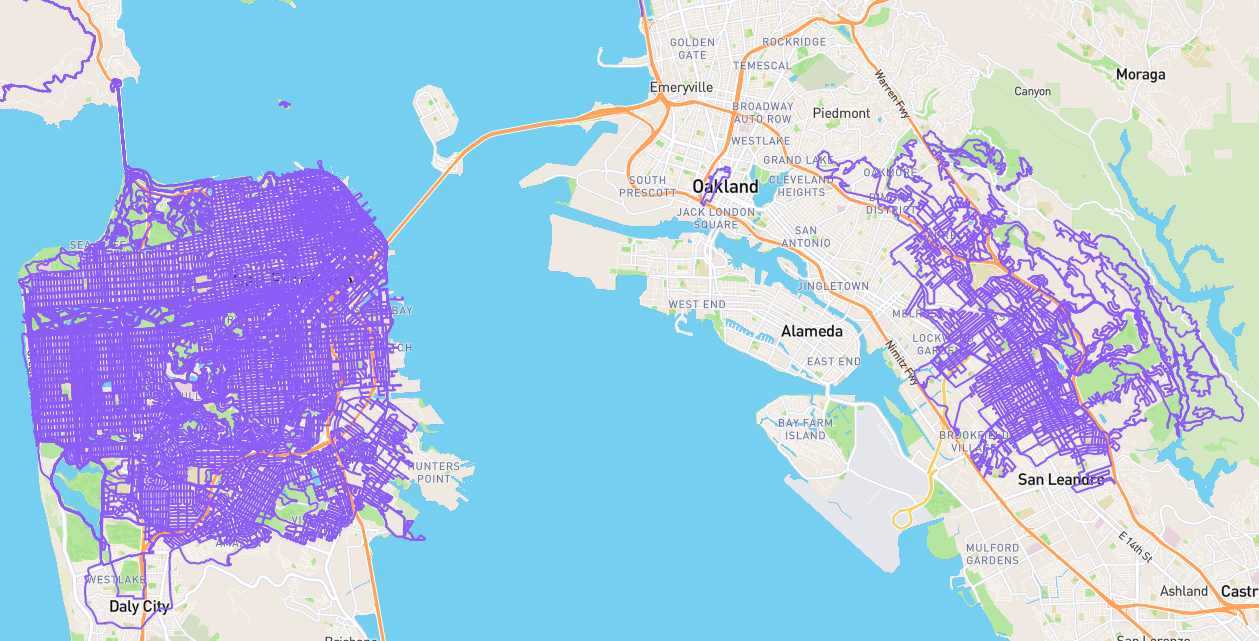
Then I thought I’d check that CityStrides site to see how far it’s come. I was pleasantly surprised, in that I was able to get some nice maps with little effort, though I had to wait an hour or two for the service to process my running history. It still doesn’t have real heatmaps, which is most obvious on my lifetime map (not sure why it currently centers on Singapore). You can’t see anything unless you zoom pretty close to the city level, but you need to first know what cities to zoom into in order to get close enough to see.
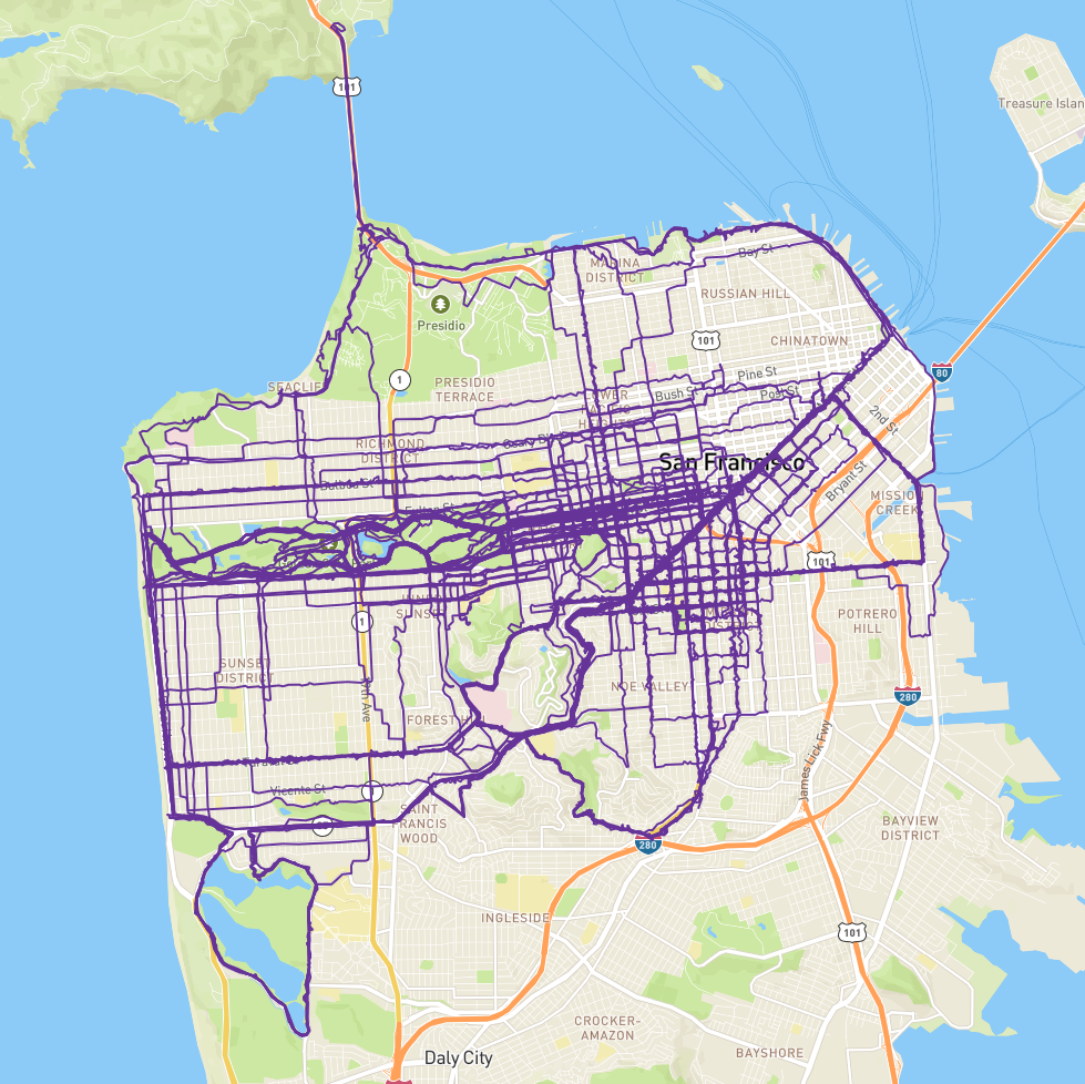
citystrides_sf_map.png
That problem could be solved using either the original approach I wrote about in November or using the new Mapbox method I haven’t tried yet.